Modernizing Insurance:
UI Redesign and Scalable Design System
Description
A comprehensive UX/UI redesign of an insurance platform, focusing on the creation of a scalable design system and the modernization of core features to elevate the overall user experience.
Context
The existing enterprise platform suffered from an outdated, inconsistent interface and dense forms that created friction for users. To resolve this, the project focused on a comprehensive redesign to modernize the interface and elevate the overall user experience. A key outcome was the creation of a design system, including typography, accessible colors, and a component library, establishing a consistent visual language and a scalable foundation for future development. I also designed the interfaces for new core features, including a multi-step wizard, an enhanced search experience, and a structured task distribution view, each aimed at improving clarity, efficiency, and usability for the users.
Goals
Two key goals were identified: (1) Detect and resolve the product’s existing design-related issues. (2) Understand the core standards and best practices behind an effective design system.
Due to NDA constraints, specific data is generalized and all texts and names have been altered.
Strategy
To build a truly scalable foundation, I needed a systematic approach to organize the platform's visual language.
Stakeholder Meetings
Alignment sessions to capture business goals, technical constraints, and user pain points.
Heuristic Evaluation
Systematic review of the legacy system against usability heuristics to identify friction points.
UI Audit
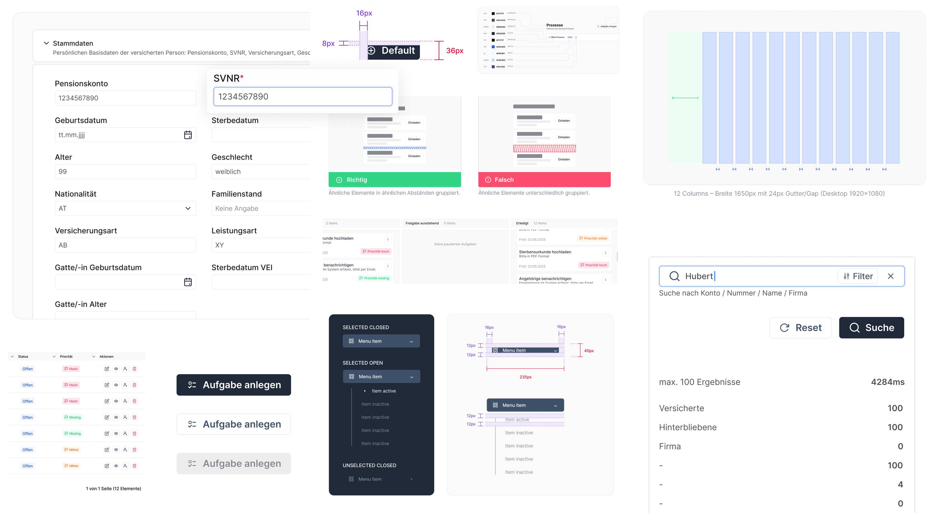
I mapped out the platform's current state, taking an exhaustive inventory of every UI element. Documenting every button, modal, dropdown, and input field highlighted stark inconsistencies and identified repetitive patterns.
Structuring
By categorizing the audited elements into a strict hierarchy, I ensured that even the smallest UI building blocks were standardized and highly scalable.
Visuals
To bridge the gap between the old and the new, I used the old designs as a baseline to experiment with modern aesthetics. I iteratively tested various typographic scales and color palettes to establish a cohesive, updated visual direction before applying it.
Design Process
To manage the complexity of the platform, the project was executed across two pillars:
Usability & Design System
This foundational pillar focused on diagnosing core usability issues and establishing the fundamental building blocks of a scalable, accessible visual language.
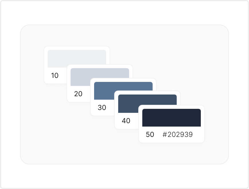
Colors & Accessibility
I developed a curated color palette reflecting the brand identity, including primary colors, a gray scale for text hierarchy, and distinct UI status colors (success, error, caution). Every choice strictly adheres to WCAG accessibility standards to ensure sufficient visual contrast.
Typography & Spacing
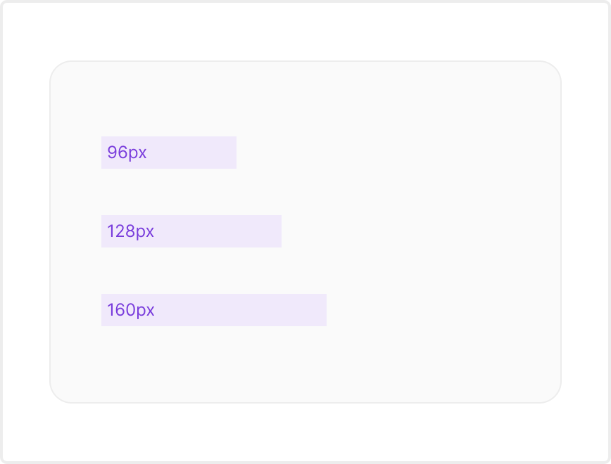
I established primary and secondary typography selections, defining specific line-heights to guarantee maximum readability. A rigid spacing system was implemented to effectively balance visual weight and prevent the interface components from feeling cluttered.
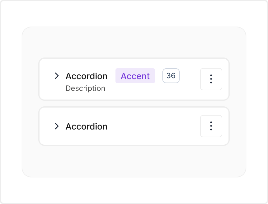
Component Library
To ensure a highly scalable and consistent interface across the platform, I defined strict layout rules, accessible interaction states, and intentional styling guidelines. This comprehensive library standardized every foundational UI component, maintaining seamless visual alignment.
Action & Text Inputs
Designed clear states for Buttons, Text fields, and multi-line Text areas.
Selections Controls
Standardized Checkboxes, Radio buttons, and Toggles for intuitive selections, alongside robust Dropdown menus and Select inputs for managing extensive options.
Advanced Inputs
Integrated Calendars, Date/time pickers, and Range sliders to handle specialized data entry, plus standardized Comment fields for user feedback.
Layout & Structure
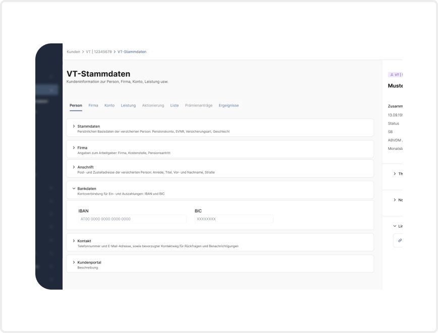
Defined a rigid page layout system utilizing grid columns to organize complex sections seamlessly. Standardized the top of every page to consistently house core titles, optionally combined with breadcrumbs, search bars, and universal filters.
Navigation
Implemented structured top horizontal navigation alongside a highly composable Side navigation system that supports nested views. Utilized contextual Breadcrumbs and clear Links to show users their exact location. Implemented Tabs to organize and group similar information on a single page, and Pagination to divide massive datasets into digestible, manageable chunks.
Icons
Integrated as essential visual cues to communicate meaning quickly and drastically reduce cognitive load for users reading dense data.
Tags
Crafted with short, meaningful text and concise icons to logically categorize complex enterprise data efficiently.
UI Redesign & Core Features
With a robust design system and usability guidelines in place, the second pillar focused on modernizing the existing interface and designing entirely new core features to streamline complex workflows.
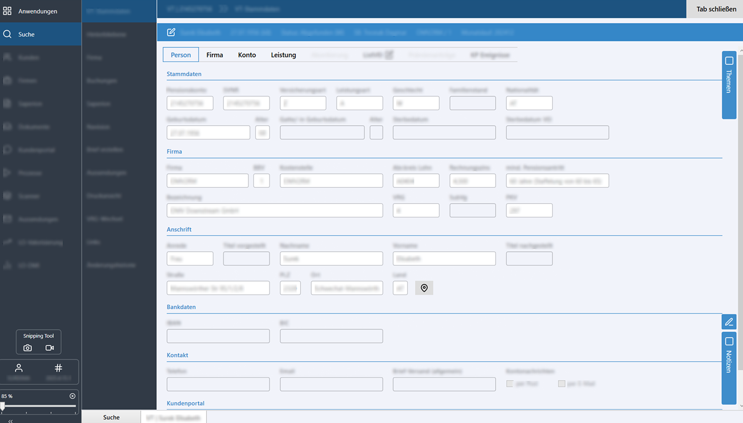
Redesign & Optimization
Based on usability issues identified during the audit, I modernized the interface to maximize user efficiency. I designed a new start page with a centralized search function, an adapted action menu, and a structured overview of applications and tasks, significantly improving overall findability.
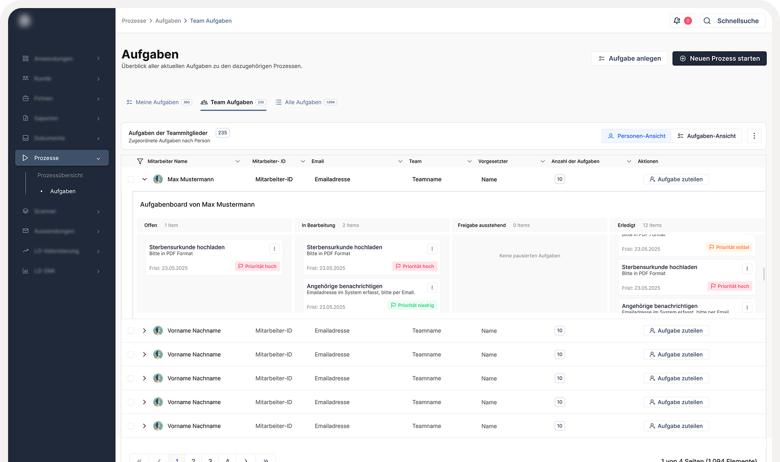
Task Management
I designed a completely new interface dedicated to task management to streamline daily operations. This directly addressed the severe lack of visual and structural hierarchy in the original dashboard, empowering users to clearly organize, prioritize, and execute their assigned tasks without unnecessary friction.
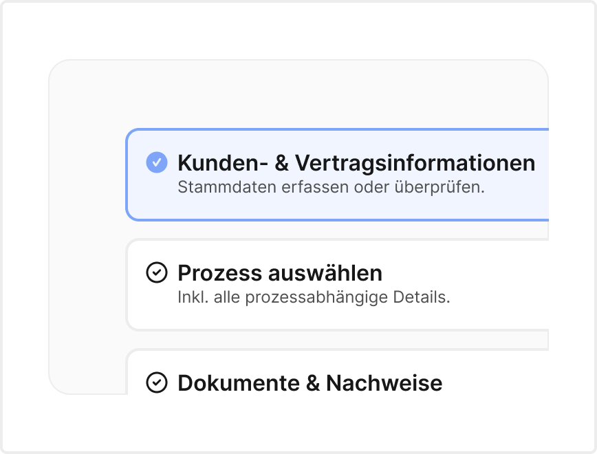
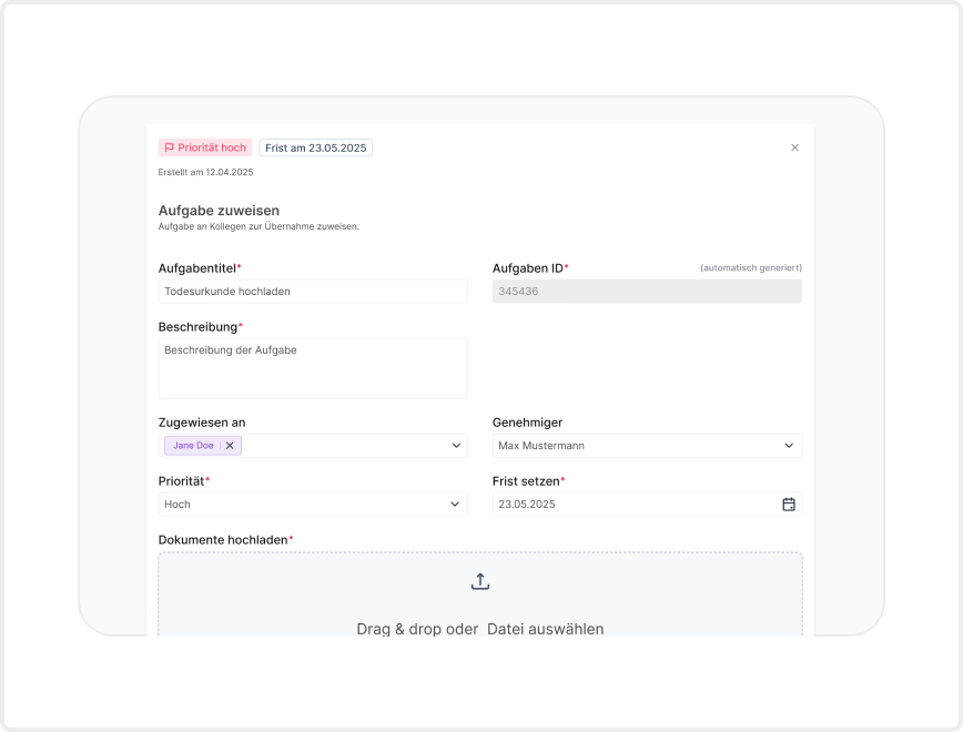
Multi-Step Wizard
To solve major pain points around complex forms and new processes, I designed an intuitive multi-step Wizard UI. By nesting smaller components into logical flows, this approach guides users through dense data entry step-by-step, ensuring clarity and a much less overwhelming user experience.
Documentation
High-quality documentation is the backbone of any effective design system, empowering cross-functional teams to make swift, consistent decisions. My goal was to create an organized, highly detailed resource that covered every aspect of the system, seamlessly integrating both design-led and development-led guidelines into one consolidated source of truth.
Figma Component Library
The initial phase involved establishing a centralized, highly organized Figma library. This provided the design team with immediate access to standardized assets, variables, and layout rules, heavily streamlining the UI prototyping process.
Zeroheight Documentation Hub
To ensure a seamless handoff and bridge the gap between design and desktop engineering, I am currently building out a comprehensive documentation hub using Zeroheight. By syncing directly with the Figma library, I am actively compiling detailed UX guidelines, accessibility rules, and standardized XAML code snippets into one centralized platform. As this resource continues to grow, it will provide the development team with clear, ready-to-use structural references tailored specifically for their WPF environment.
Future
A design system is a living, ongoing project. We constantly iterate, adapt, and learn throughout the process. Delivering this foundational set of basic components will massively improving overall efficiency, consistency, and standardization across the platform.
To ensure the system continues to scale successfully, the next strategic steps include:
Scaling the Library
Continuing to grow the component repository by designing and documenting more complex, data-heavy UI elements.
System Governance
Cultivating strict processes and best practices for maintaining the documentation, ensuring the Figma design components and the Zeroheight documentation hub stay perfectly in sync as the visual language evolves.
Testing
Building robust processes for testing new components to guarantee ongoing compliance with internal design guidelines and strict WCAG accessibility standards.